Bravo Izquierdo
Visual Identity for Real Estate and Construction Company
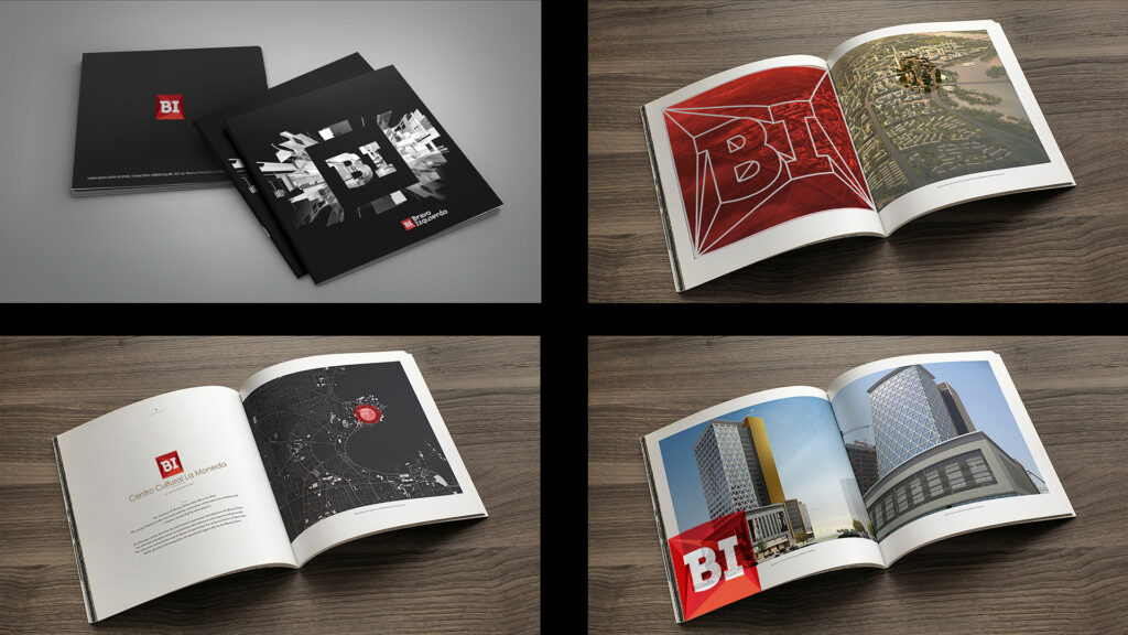
Brand identity for BravoIzquierdo (BI)
Bravo Izquierdo has gained a name in the world of Real Estates and Construction Companies.
The challenge: Redesign its corporative image to portray modernity, strength and diversity of propositions in the architectonic execution.


Design in the way of thinking, design in the way of executing.
Solid isn’t a synonym for boring, a solid brand has to be capable of reinventing itself and has to be capable of being playful and luring. The left hemisphere introduced into the right.